Infographics – Classic Communication Made Modern
Infographics are becoming a hot topic among social media outlets and communicators.
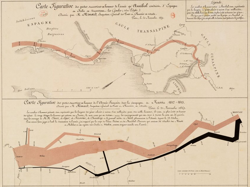
Bloggers such as Maggie Koerth-Baker at Boing Boing and Marcie Giovannoni at Complex Visuals have written about the recent jump in interest in infographics, which deliver often numerically-laden information in a way that helps, not hurts, understanding. Koerth-Baker also explores the history of this communication art, including an illustration considered to be the best infographic ever created, the map by Charles Joseph Minard that illustrated the destruction of Napoleon Boneparte’s army in the Russian campaign of 1812.
 Public relations practitioners are climbing aboard the infographics party train. PR Daily’s Meryl Serouya recently wrote an article specifically exploring the use of infographics as press releases, citing their brevity and focus, especially when distributed via social media channels.
Serouya wrote that infographics “can prove especially powerful in press releases by extending the core message and highlighting the important components to bring the text to life.”
I agree completely. Infographics certainly are full of promise as communication channels, although I would not go so far as to say they should replace a news release. If I was advising a client about the use of infographics, I would say that they do have their place, but not as stand-alone releases.
 An interesting infographic could accompany a news release, whether it is e-mailed to media outlets, posted to an organization’s Facebook page, or Tweeted to its followers, giving the story extra context, drama, and background while explaining the more complex parts.
Even though infographics have been around for a long time (like the 17,000-year-old Lascaux cave paintings in France), a well-crafted infographic still has the power to take dry information and make it seem fresh and new and understandable. I’m looking forward to seeing how this hybrid of art and communication will change and grow in the future.
Follow me on Twitter at @charlesprimm.


Reblogged this on complexvisuals and commented:
Great post by Charles Primm.
Complex Visuals
February 20, 2012 at 4:15 pm
[…] amazing to see the creativity at work lately in the area of infographics. As I’ve written before, this informational, educational art form has been around for a long time. But 2012 really seems to […]
There’s Famous, and Then There’s Infographic Famous « Cautiously Optimistic
May 29, 2012 at 8:07 pm