Posts Tagged ‘infographics’
There’s Famous, and Then There’s Infographic Famous
It’s amazing to see the creativity at work lately in the area of infographics. As I’ve written before, this informational, educational art form has been around for a long time. But 2012 really seems to be the year when it caught fire.
PR Daily 12Most.com’s Anita Hovey recently listed some of the top infographics in the world of social media. Among the best was “Seven reasons to embrace online culture,” by J6 design. From “showing you are human” to “don’t ignore negative online reviews,” these are great tools to have in your toolkit if you find yourself having to convince the boss to include social media as part of your office’s overall public relations and marketing efforts.
But, since social media has empowered the “me” in all of us to an extent never before seen, my favorite infographic has to be “What About Me?” from Intel. This free online service mines your Facebook and Twitter feeds to create a custom infographic about little ol’ you.
 Here’s mine. This is the thumbnail version, so click to see the larger version. Fascinating, huh? I think so, but then, that’s just me. And it can be you, too.
I’m not so sure it will make me famous, though, or even infographic famous. And maybe that shouldn’t even be my ultimate goal. I’m just happy looking at a graphically pleasing, informative display about the details of my online life, in a way that can help me be a better communicator and a better person.
Follow me on Twitter at @charlesprimm.
“Pink Slime” Gets PR Assist
An effective crisis communication response plan has always been part of successful public relations. It seems obvious to state this, but for many years, good crisis communications was like a well-kept secret, slowly trickling out to the wider industry over time and, seemingly, only in response to historic PR disasters like Exxon’s response to the Exxon Valdez oil spill and the decision to launch the Challenger space shuttle, as well as in recognition of crisis communication success stories like the Tylenol cyanide poisoning response.
So it’s tough to watch the Beef Products Inc., a Texas-based company, in the PR fight of its life in the wake of the recent “pink slime” controversy. This PR Daily story by Gil Rudawsky summarizes how social media powered the efforts of parents to get the beef products banned from schools and removed from grocery store meat departments.
The company, which uses industrial processes to retrieve tiny scraps of trimmed beef that otherwise would be discarded, launched the beefisbeef.com website to explain why the meat is perfectly safe and nutritious, and to argue why the term “pink slime” is wrong, misleading, and libelous.
 They even include an effective infographic that explains why the use of ammonia in the process, one of the problems cited in the “pink slime” protests, is actually common throughout the food processing industry.
I use the word “tough” to describe this campaign because, on a technical level, while the company seems to be doing everything about as well as it can be done to address the critics and try to set the record straight, I suspect that the power of the phrase “pink slime” may be too much for them to succeed in the long run.
The Center for Media and Democracy’s famous PR industry expose, “Toxic Sludge is Good For You,” ascribed wondrous powers of persuasion to the practice of public relations. But nothing, not even PR, is totally invincible. In the end, the public does get to decide what they like and what they don’t like. And, if they don’t like “lean beef trimmings” or “pink slime,” they will vote with their dollars and reject the product.
— Update: April 2, 2012: The Consumerist reports that AFA Foods, another manufacturer of “lean beef trimmings,” has filed for Chapter 11 bankruptcy, blaming the uproar over the “pink slime” news coverage.
Follow me on Twitter at @charlesprimm.
Infographics – Classic Communication Made Modern
Infographics are becoming a hot topic among social media outlets and communicators.
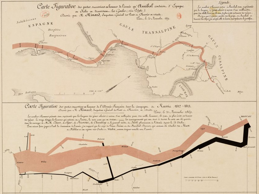
Bloggers such as Maggie Koerth-Baker at Boing Boing and Marcie Giovannoni at Complex Visuals have written about the recent jump in interest in infographics, which deliver often numerically-laden information in a way that helps, not hurts, understanding. Koerth-Baker also explores the history of this communication art, including an illustration considered to be the best infographic ever created, the map by Charles Joseph Minard that illustrated the destruction of Napoleon Boneparte’s army in the Russian campaign of 1812.
 Public relations practitioners are climbing aboard the infographics party train. PR Daily’s Meryl Serouya recently wrote an article specifically exploring the use of infographics as press releases, citing their brevity and focus, especially when distributed via social media channels.
Serouya wrote that infographics “can prove especially powerful in press releases by extending the core message and highlighting the important components to bring the text to life.”
I agree completely. Infographics certainly are full of promise as communication channels, although I would not go so far as to say they should replace a news release. If I was advising a client about the use of infographics, I would say that they do have their place, but not as stand-alone releases.
 An interesting infographic could accompany a news release, whether it is e-mailed to media outlets, posted to an organization’s Facebook page, or Tweeted to its followers, giving the story extra context, drama, and background while explaining the more complex parts.
Even though infographics have been around for a long time (like the 17,000-year-old Lascaux cave paintings in France), a well-crafted infographic still has the power to take dry information and make it seem fresh and new and understandable. I’m looking forward to seeing how this hybrid of art and communication will change and grow in the future.
Follow me on Twitter at @charlesprimm.

